
Branding - Passion Project
2025
3 Weeks
A heart-first food brand that bridges the emotional gap between the daily hustle and the nostalgia of mother’s cooking.
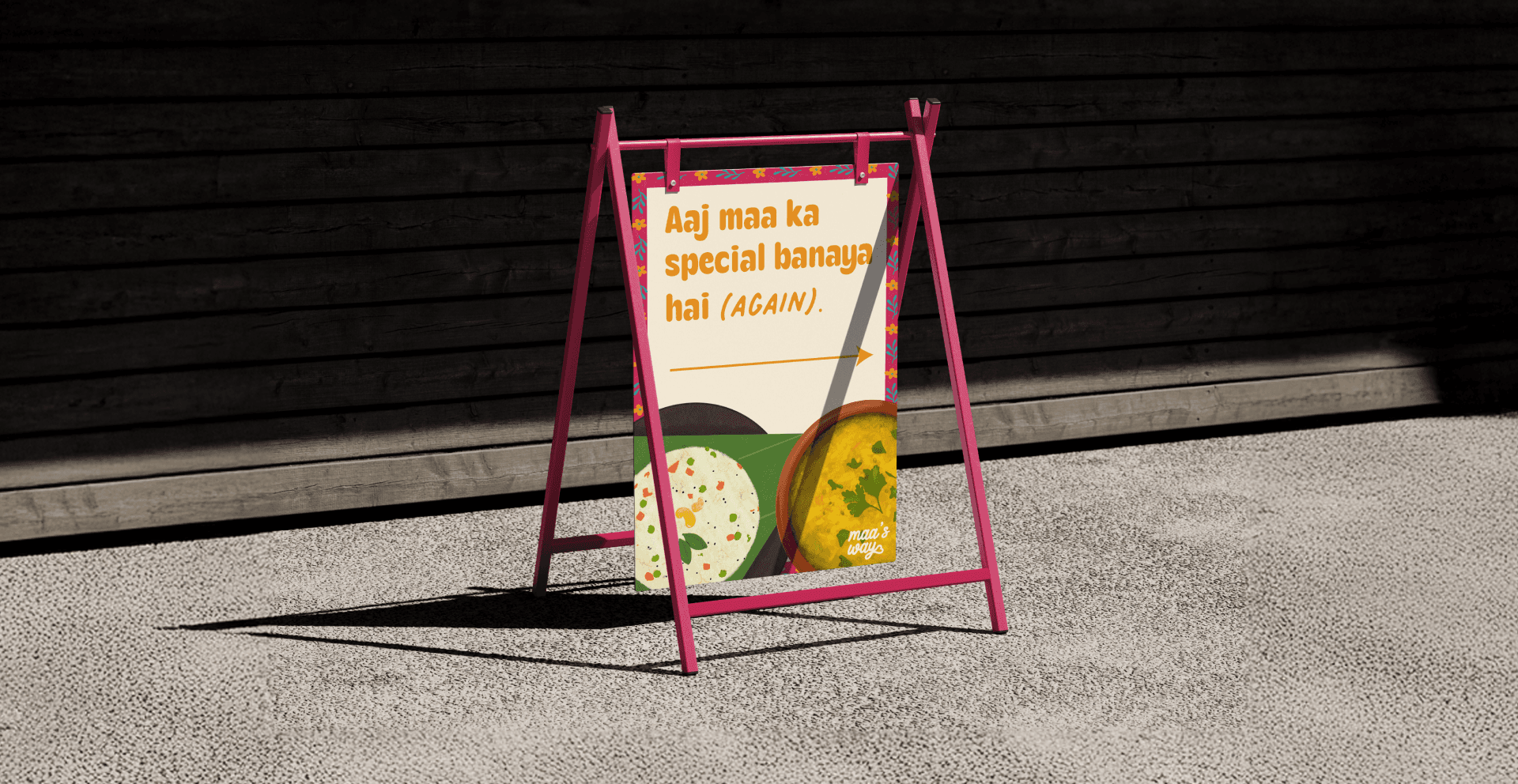
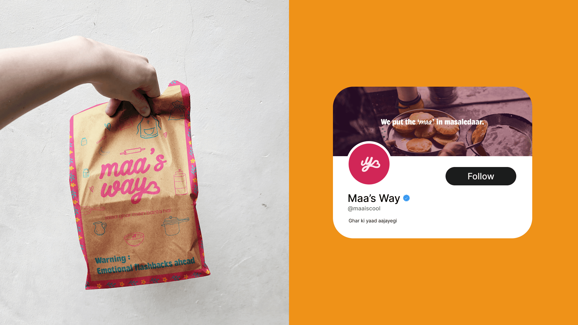
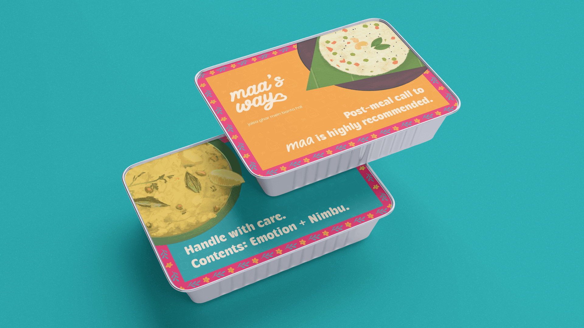
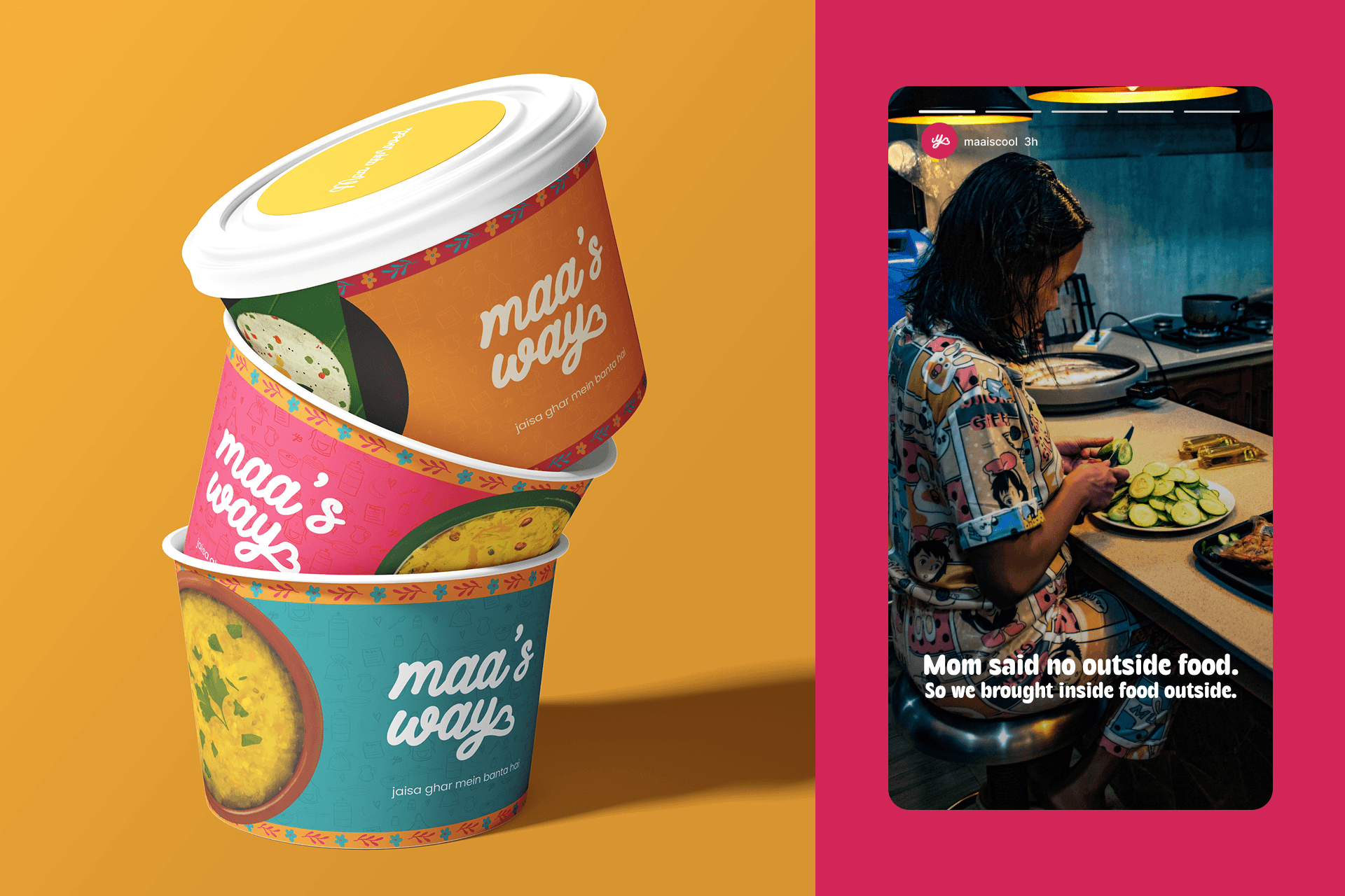
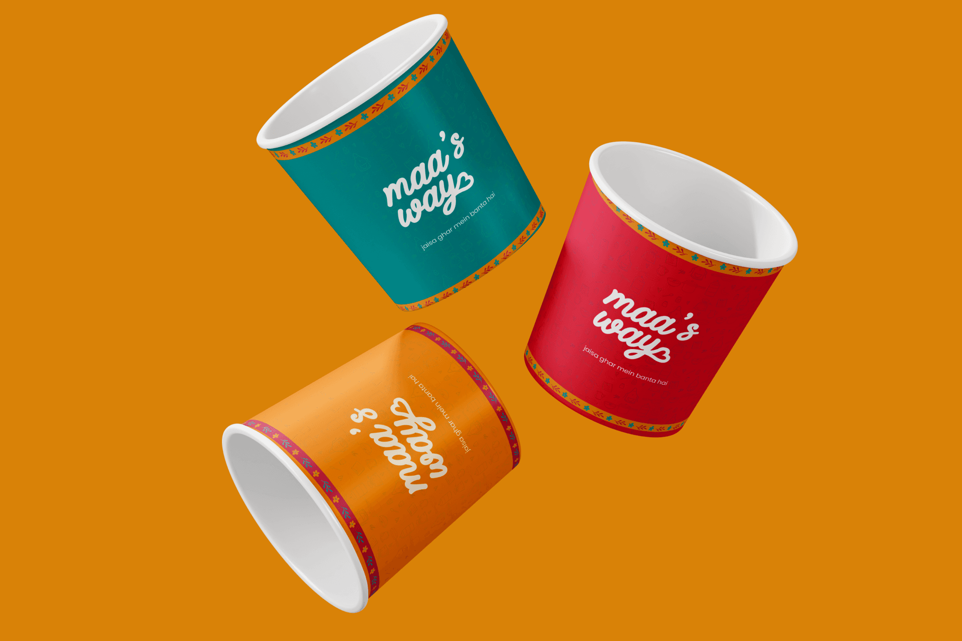
THE PROJECT Maa’s Way is a heart-first food brand designed to bridge the emotional (and culinary) gap between home and hustle. It’s a celebration of the most comforting element in every Indian home, maa ke haath ka khaana, but served with a side of sass.
THE PROJECT Maa’s Way is a heart-first food brand designed to bridge the emotional (and culinary) gap between home and hustle. It’s a celebration of the most comforting element in every Indian home, maa ke haath ka khaana, but served with a side of sass.

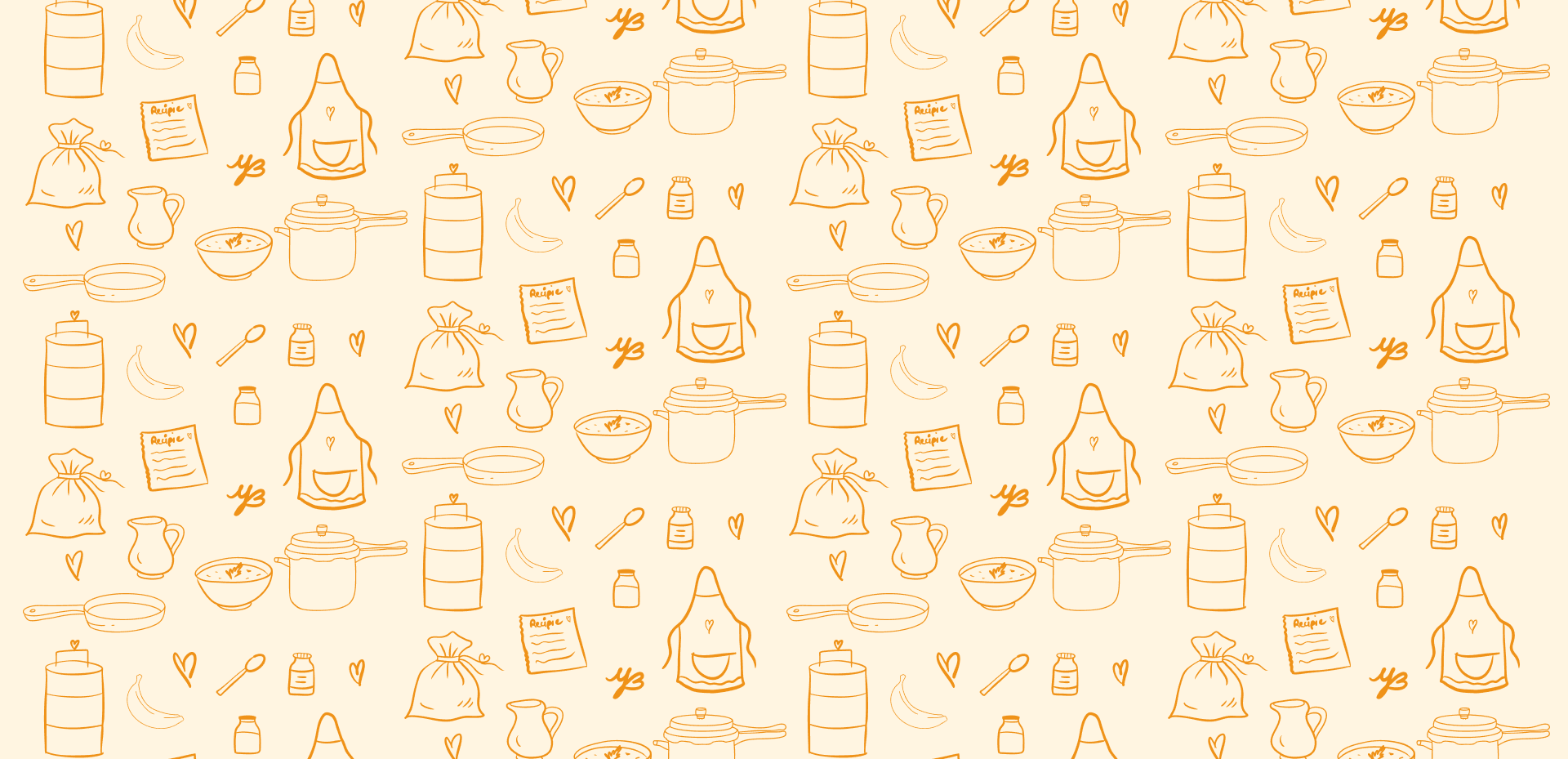
The brand identity explores the duality of the Indian mother: fiercely loving, occasionally sarcastic, always nourishing. That’s reflected through hand-lettered typography, warm mother's color palettes, playful messaging
The brand identity explores the duality of the Indian mother: fiercely loving, occasionally sarcastic, always nourishing. That’s reflected through hand-lettered typography, warm mother's color palettes, playful messaging

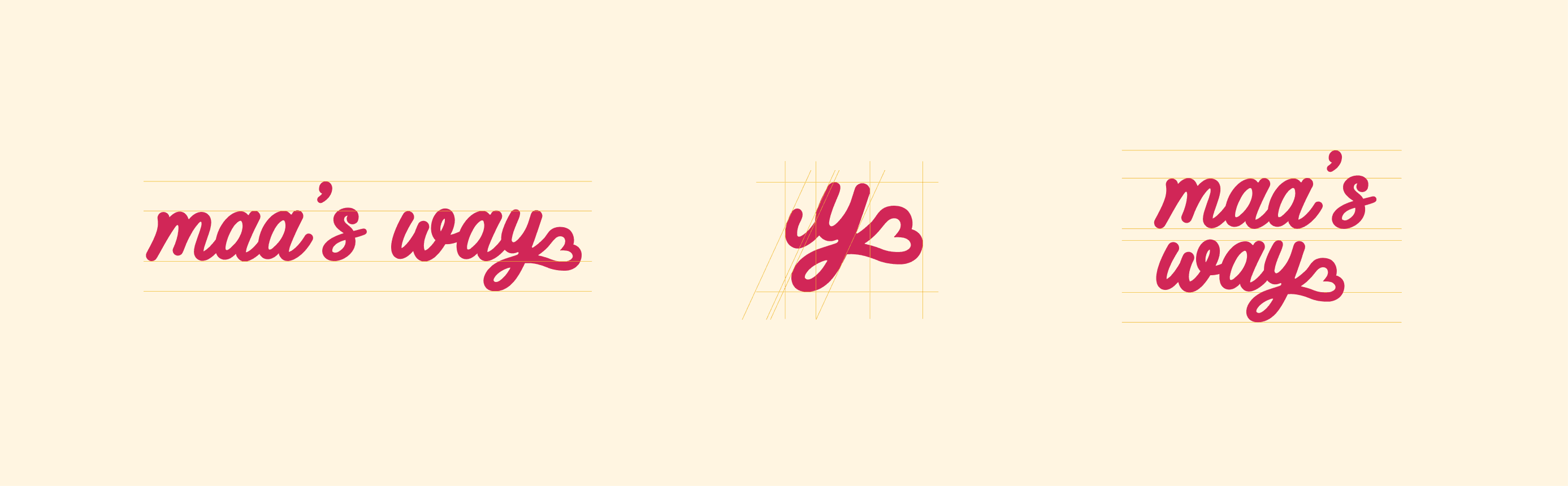
The monogram logo for Maa’s Way is built around the lowercase “y” the final letter in “way”, flowing naturally into a heart shape. This simple, warm gesture becomes the visual essence of the brand.
The handwritten “y” connects directly to the word “way”, suggesting that maa’s way always ends in love.
The heart at the end isn’t just decorative, it’s maa’s signature. A quiet reminder that she adds a little care to everything.


© 2026